
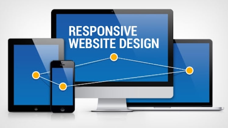
First, let’s take a look at what a flexible site (responsive web design) is. This is a page design that provides a correct and convenient presentation of the site for a mobile user. A responsive website automatically adjusts itself to the size of the browser window. The goal of a web design that is flexible for electronic gadgets is the versatility of the site presentation. This means that there is no need to customize the site for a particular type of gadget, the responsive web resource is displayed correctly on any mobile devices, laptops, and even on a TV. At the same time, surfing the resource will be equally convenient on any device and the user does not need to enlarge the selected blocks so as not to click on the wrong button.
How do test responsive web design?
There are two ways to test site responsiveness. Open the page, try to reduce it in width and height. If the blocks are rearranged to fit the resolution and there is no horizontal scrolling of the page, then the site is responsive. You can also use special services, which we will talk about a little later. Responsive web design services.
Why do you need a responsive website design?
1. It is convenient
The responsive site can be used from any device, which improves the convenience of navigating through the pages.
2. He’s profitable
The number of mobile users is increasing every year, which increases traffic to the adapted resource, increases conversion and company profits.
3. He is promoting
Non-responsive resources rank significantly worse in Google search results when searching from a mobile gadget. In mid-2015, Google introduced a new filter, “Mobile-friendly”, which is responsible for ranking sites when searching from a mobile device. Website adaptation is very important for SEO website promotion. If it is friendly to Google and intelligently optimized, then it will definitely get into the TOP and attract the maximum number of customers and increase the company’s revenues. Plus, Google has already started prioritizing responsive sites. Therefore, if you do not have it, be sure to order it, as you risk losing some of your mobile traffic.
4. It increases audience loyalty
A mobile user, choosing from two sites of the same niche, will give preference to the one that is adapted for his gadget.
A responsive site has its drawbacks:
* Resource adaptation implies the exclusion of some graphic and technical elements in order to improve the usability for visitors;
* Slow loading of the site due to the heavy weight. Even if we exclude all the technical and graphic components that add page weight, the responsive site still loads slower compared to the loading speed of the standard version of the website on a PC, or a separately developed mobile version;
* Inability to link to the full version of the web page (in the case of the mobile version, this is possible).
The difference between the adaptive version of the site and the mobile
Unlike a resource that is customized and has a single URL, a mobile modification is created on a subdomain. The mobile version of the site implies the maximum simplification of the page, the disposal of some of the content and functionality. Along with faster loading (the adaptive version of web pages loses in this and requires additional optimization of the loading speed), creating a mobile version of the resource is expensive and costs the same as developing a mobile application. All the disadvantages of a flexible site are the advantages of a mobile site type, and its disadvantages are the advantages of an adaptive one.
With the dynamic increase in mobile users and the introduction of a new algorithm by the Google search engine, site responsiveness is becoming not just a way to increase sales, but a real necessity. We recommend that you pay due attention to all the factors that we have disclosed in this article and make the right decision. If you liked the article, tell your friends about it. Check here.